Structured Content Initiative—What happened in April? The survey results!

Categories: Development, Community Created by Rachel Foucard
Blue sky full of colorful hot-air balloons
Photo: Kyle Hinkson / Unsplash (CC-0)
As promised in our last article, here’s our latest update from the TYPO3 Structured Content Initiative. Today we’re sharing results from our Survey of TYPO3 Editors.

The Structured Content Initiative is the core Strategic Initiative focused on improving the content editing user experience in TYPO3 CMS. Read our last update to learn more about what we’ve been working on. 

Connect to TYPO3 Slack and join us in the #cig-structuredcontent channel.

Participant Profiles

Technical and Non-technical

With time and perseverance, we managed to get enough answers from profiles that are not specifically developers (more than half of the respondents). This was very important to us because our initiative is responsible for features that will benefit both technical and non-technical profiles. 

Thanks to this, we were able to check whether the answers were different for the technical and non-technical profiles. Where this was the case, we highlighted it in the graph. Where this was not the case, we stacked the results of the two profiles to highlight another piece of information instead. 

Prior to this survey, we thought that the technical and non-technical profiles had very different, perhaps even opposing, opinions, habits and needs, but that's not the case! Indeed, most of the time the opinions are very similar, and when we have detected a difference, it is significant but not radical.

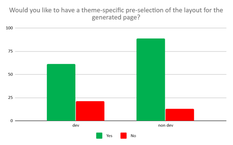
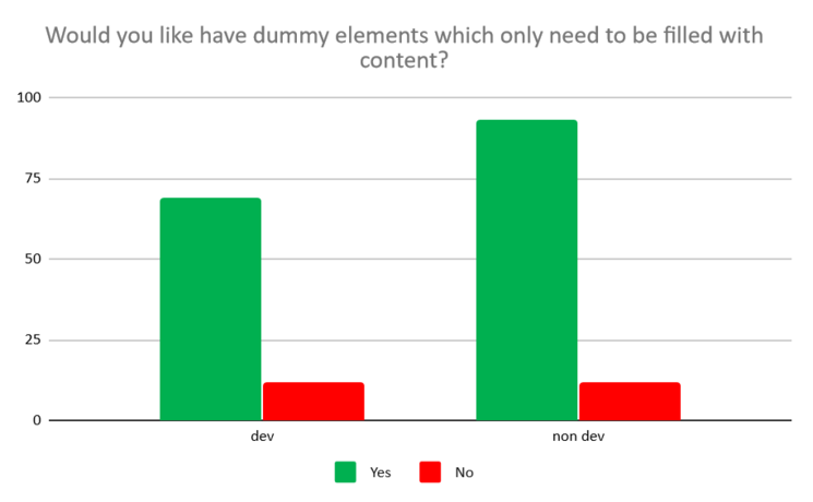
Both would like to have presets or dummy elements but the need seems more obvious on the non-technical profile side:

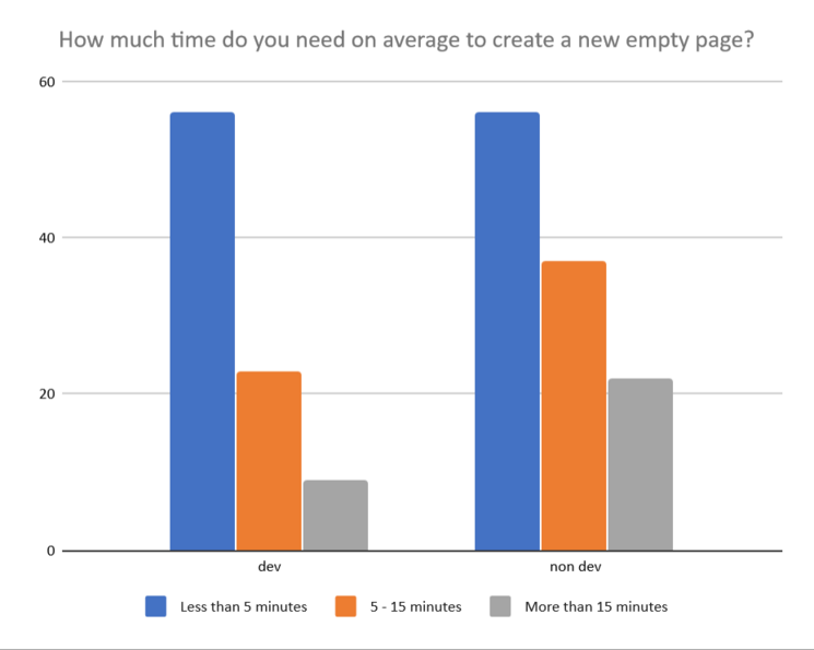
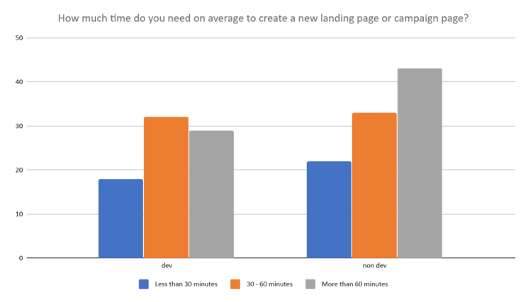
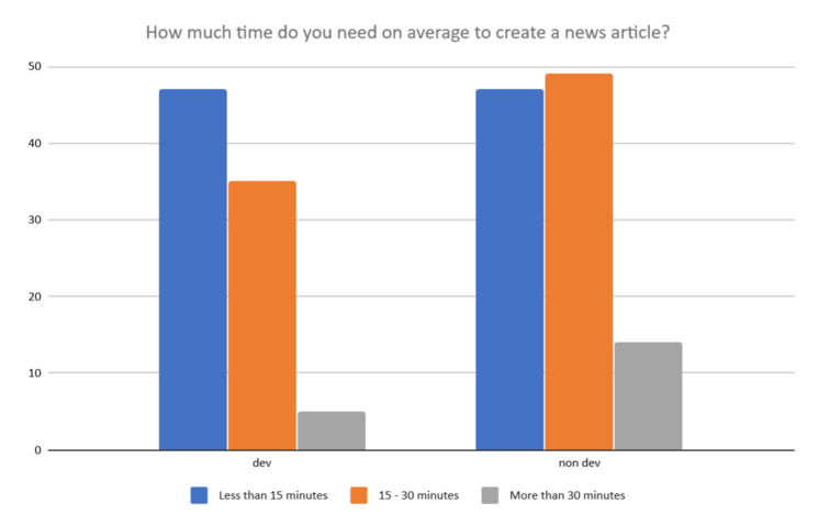
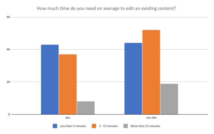
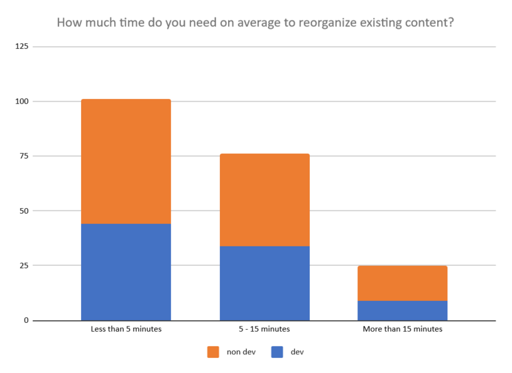
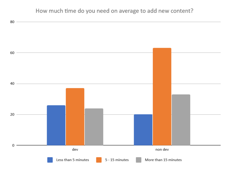
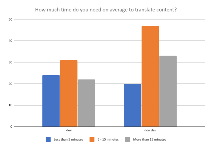
Generally, non-technical profiles are considered to take a little more time (but not much more) than technical profiles to achieve editing tasks:

As the answers are based on self-reporting and not user testing, we can say that non-technical profiles perceive that they need more time to perform the same tasks. We speculate the different causes can be among the following:

  • they do the tasks less regularly than the technical profiles so they are less comfortable and less fast
  • they have another job in addition to contributing to a website, these tasks are more interruptive for them, and cost them more time
  • the interface they have to use to perform these tasks is more technical-friendly

Not So Young and Rather Faithful to TYPO3

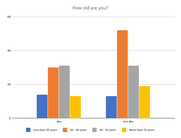
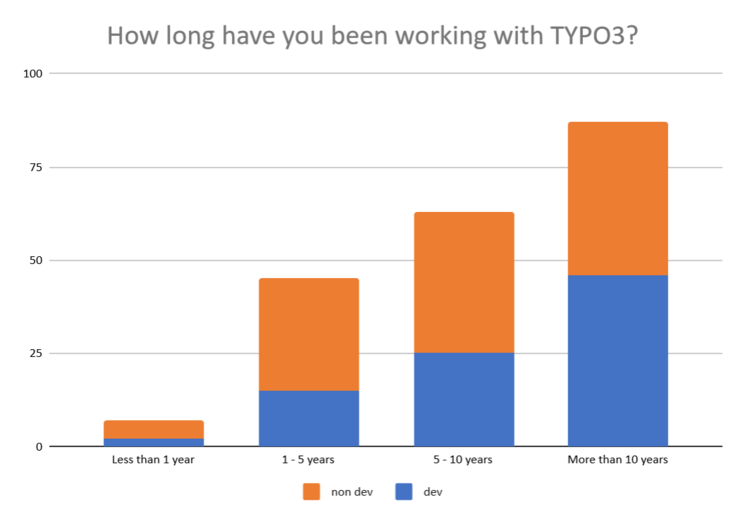
Our user panel is mostly older than 30 and has been working with TYPO3 for more than 5 years.

This is interesting because we are discovering that our user community is very faithful. This is great news! But it's also a big challenge when it comes to working on initiatives that will bring transformations. Change sometimes brings resistance, fears and frustrations. On the other hand, we must not miss the new users expectations, who have only one request: "Don't make me think!"

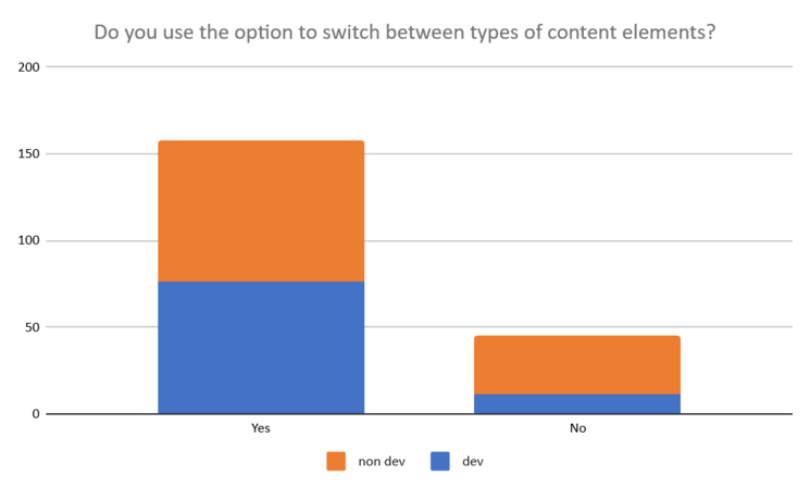
We were quite surprised by some answers, because we thought that some features were almost not used anymore, such as switching the type of a content, or the use of the list module for some actions that can be done today in simpler ways.

This may be due to the commitment to a way of doing things, or simply to the lack of knowledge of new possibilities when switching to a new version.

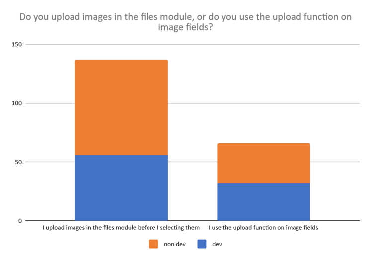
Also, our users seem to appreciate the well-structured side of TYPO3, and for example, like to control their media organization rather than throwing them anywhere in a file manager.

Users’ Most Common Actions

Although TYPO3 is a CMS designed for multilingual projects, surprisingly, translation is not part of the most common actions. The most common actions users undertake are the creation of pages, contents and news. We have also found that creating landing pages is not so rare nowadays, it seems to be an more and more frequent action. This need will have to be taken into account.

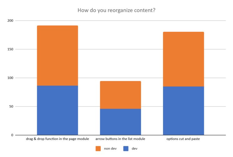
The Drag and Drop Action

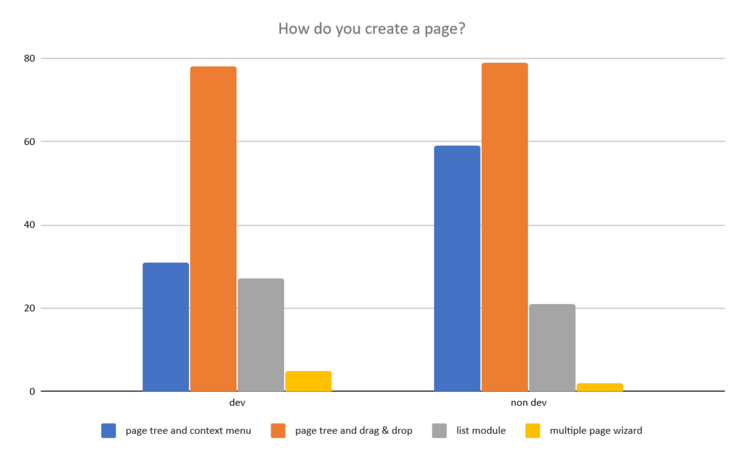
Drag and drop seems to be a technique appreciated by our users. According to the survey results, it is the most used method for an action if it exists, both for adding a new page or moving a content. It is an easy method with a mouse or on touch screens, as it is close to a natural action. It is not impossible to integrate it while respecting accessibility standards, and for users who prefer it, drag and drop can also be completed with the click-and-click method (click on the element, then click on the destination).

The two results above also give us information on other methods:

  • We can see that the contextual menu method is more used by non-technical profiles, probably because this method is very useful for more occasional users who don't want to memorize how something is done.
  • Cut and paste is still very much used to move content, probably to move it from one page to another because in this case drag and drop is not possible.

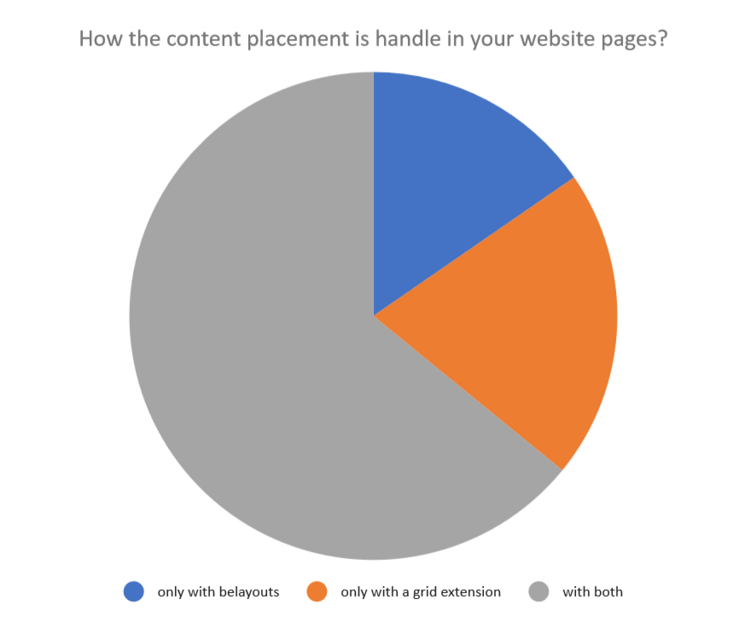
The Grid System

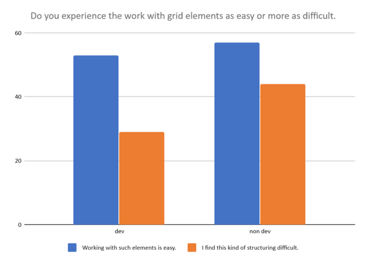
The answers concerning the current grid system are also very instructive: there is currently no opposition between page templates with pre-established columns or free columns content systems. This can probably mean that it is sometimes necessary to structure a page with pre-established areas that cannot be modified by an editor, and sometimes it is necessary to give him/her more freedom.

In any case, the need for this feature is obvious, as it is widely used, although the user experience is not very satisfying.

The View Module

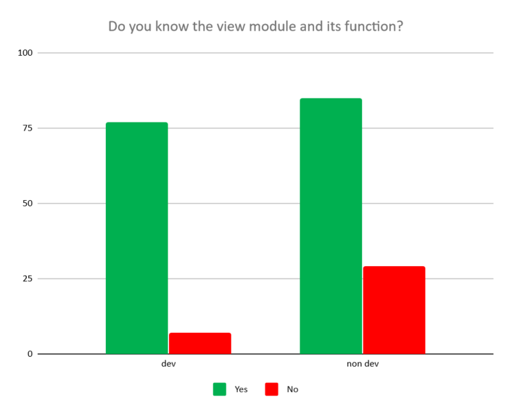
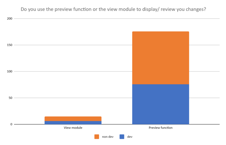
The View module is an important part of the editing process of a page, because editors need to visualize the result of his modifications at a fairly high frequency when they are building a page. 

We have found that everyone is familiar with the view module, and we can even add that when we present it to customers during a demonstration, they often find it very attractive, especially its preview capabilities in responsive mode. However, and it may seem inconsistent, this module is rarely used!

The conclusion is that there is a great opportunity for improvement here, because we can see the potential of this module, but we can also see very well that the user path is not built in such a way as to speed up or facilitate the work of editing and previewing the page. So we're going to work on that.

TYPO3 and Other CMSs

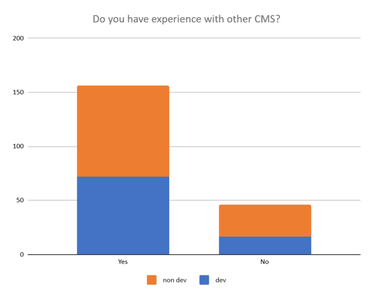
Most users do not work exclusively with TYPO3 CMS, which gives them a legitimate critical view on features and user experience.

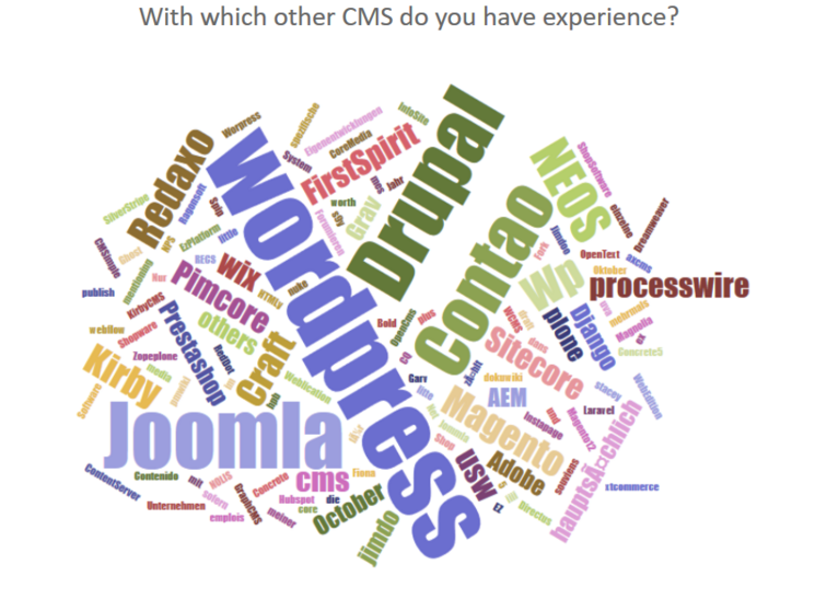
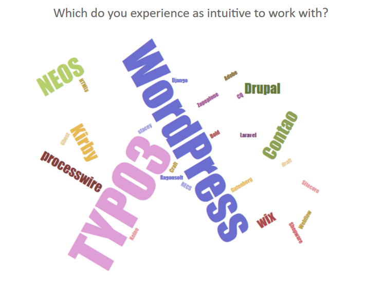
Not surprisingly, we find the best known CMS on the market among the tools they use. And among those they find intuitive to use, TYPO3 and WordPress are the most mentioned.

Reservations and Gray Areas

We tried as far as possible to be particularly careful to keep this article factual, and especially not to try to correlate two statistics. If a result raises new questions, we will create other mini-surveys, very short and focused on a particular issue to complete the study before releasing the result and before making decisions for our initiative.

For example, we asked the participants if they know what a plugin is, and a large majority answered "yes". In fact, we can't say whether they really know what a plugin is until we ask them specifically what their definition of the term is. So we have to go further :)

In the same way, we asked if they know the difference between the list module and the page module. This question was too vague to draw conclusions from the answers.

Finally, while we are very pleased to have received about 200 responses to a survey that took 15 minutes of participants' valuable time (we thank them very much!) We realize that this is a relatively small sample for a survey. For this reason, the surveys that follow will be shorter, in order to collect more answers - we hope!

The Structured Content Initiative team.

 
Proofreading: Heather McNamee