The Structured Content Initiative is the core Strategic Initiative focused on improving the content editing user experience in TYPO3 CMS. Read our last update to learn more about what we’ve been working on.
Connect to TYPO3 Slack … and join us in the #cig-structuredcontent channel.
Welcome Paul Hansen to Our Team!
We are very pleased to welcome Paul Hansen to our initiative. For several months he has invested a lot of time helping with the tasks of our different groups. Here is a short introduction by our new member:
“Hello! I've really enjoyed collaborating on this initiative and putting my experience to work improving TYPO3. I live in Vermont, USA, and I've been building sites with TYPO3 since 2004. My agency, Ecopixel, provides TYPO3-powered web development and web design services to a variety of nonprofits, municipalities and outdoor adventure businesses, with a particular focus on serving conservation organizations. I'm also an avid skier, sailor and photographer.”
Latest Survey Results
This summer we launched two surveys to better understand editors’ preferences for viewing the frontend version of the pages they build, and their use of the mobile version of the backend. About 85% of the respondents of both surveys were “mostly technical” users (developer/integrator). Here is a summary of the answers we collected:
The “Mobile First” Survey
72% had never used the TYPO3 backend via mobile device, either because they didn't know it was possible or because they always have a computer at hand. This is probably related to the mostly technical profile of these users. For those survey participants who had used a mobile device, the primary reason cited was during an emergency, when it’s impossible to use a computer (54%). The second reason is when the user is on the move (in a train, subway, bus, waiting room, etc.) (31%). For those who use the TYPO3 backend in mobile version, it is mainly with a smartphone (92%) and not a tablet. Respondents reported that the user experience is good enough to modify existing content, or records such as news, addresses, etc. However, they mostly avoided creating a whole new page using their smartphones, or found the experience to be less than satisfactory.
The “Preview My Work” Survey
We asked participants about how they view their content in the frontend after creating a page, changing the pagetree, before making page edits, or after editing content. We learned that the View Module is rarely used (between 0% and 7%), whatever the situation. When you want to view the frontend of an existing page before working on it, when you have just created a new empty page, when you have just created, modified, moved, deleted content inside the page, when you have just modified the page tree (renaming, moving or deleting pages), what do you use to view the result in the frontend? Instead, survey respondents were most likely to view the frontend page by:
- Clicking the “view webpage” button at the top of the page module
- Reloading the frontend of the page that is already open in another tab
So, what are we going to do with this feedback? Don't worry, we certainly won't decide that mobile support in the page module is unimportant. We believe it’s not being used much on mobile devices because it’s not good enough, we will improve it in the new page module. The View Module feedback is relevant to both our initiative and the frontend editing initiative. It's an important part of the process of creating a page, and it deserves more consideration, with all the stakeholders, before finding the best solution.
The November Sprint
The first (remote) sprint of the TYPO3 Structured Content initiative took place on November 5-8, 2020. It was particularly productive, as we were able to make progress on many tasks, such as user stories, mockups, concepts, and even coding the new content block creation API and the new page module extension.
Content Block Creation
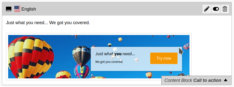
The API for content blocks registration has a lot of technical issues to consider: custom composer installer, validation of content block packages, generation of necessary code for TYPO3 (TCA, TSconfig, TypoScript) and of course, the big question of storage method. In order to have the main idea of our concept test-ready as soon as possible, we chose the “divide and conquer” approach, splitting the implementation into parts which we will deliver as an extension.
The first and most important part includes all key features of our concept:
- Identification of a content block package
- Generation of necessary code for TYPO3 (TCA, TSconfig, TypoScript)
- Parsing the EditorInterface.yaml
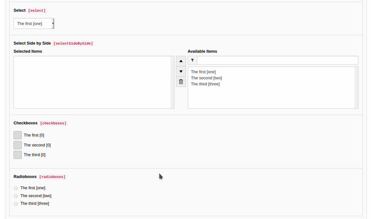
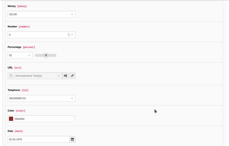
Our research about performance on the persistence layer to identify the best suitable storage method for content blocks is still in progress. So, we decided to go for a Flexform-based approach first: generate a Flexform instead of pure TCA out of the EditorInterface.yaml and store it in the new field “content_block” in “tt_content.” This is only a temporary solution that helps us to accelerate the first deliverable and will be replaced in the next version.
For our API extension, we created the content-block-registration-api repository on GitHub and made tremendous progress during our code sprint. The extension currently features two installation methods: development with ddev, and the usual composer installation to just use the API for your own content blocks in a project. It does a basic validation of a content block package (Are all necessary files present? Is the EditorInterface.yaml in a valid YAML format?) and then registers it in TYPO3. It also brings a number of example content blocks which are located in the “Build/packages” folder.

