Structured Content Initiative—What Happened in May–June 2020?

Categories: Community, TYPO3 CMS Created by Rachel Foucard
Gray metal construction frame next to a yellow brick wall.
Photo: Boris Misevic / Unsplash.com (CC-0)
A lot of things have happened since May 2020, we have made progress on UX concepts, on content block creation, and on rendering strategies. Here is some important information about our latest achievements.

The Structured Content Initiative is the core Strategic Initiative focused on improving the content editing user experience in TYPO3 CMS. Read our last update to learn more about what we’ve been working on. 

Connect to TYPO3 Slack and join us in the #cig-structuredcontent channel.

Two New Surveys

If you have not yet answered these two new surveys, benefit from a quiet moment this summer to use 5 minutes of your valuable time:

Not in Our Scope, but on Our Path

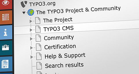
During several workshops on the new backend interface of the future page module, we agreed that the first two steps required to reach this module (choose the module, then select the page) needed to be improved.

Indeed, the module bar and the page tree bar are the two key elements of the TYPO3 backend interface, and it is essential for almost all modules. Among the user responses to our first surveys, many refer to usability or accessibility problems with these first two necessary clicks. We have therefore worked on these two areas with the kind collaboration of the members of the Accessibility initiative. The objectives of the modifications we are going to propose are:

  • The actions have to be accessible to all.
  • Interfaces must be mobile first, or at least mobile friendly.

Approved Concepts of the Next Module Page

The following concepts have been approved by the UX Working Group, which means that they will be implemented and tested. If the usability testing of these changes requires adaptations, they will be integrated following the direction of these initial concepts.

Three Tips: Simplify, Simplify, Simplify (J.Nielsen)

Having a simplified page module is an important first step because if we add a grid system, we will also add a lot of visual information and interactions.

One of the important problems to solve is that the current backend page module is still very different from the frontend because of a lot of useless information and design. Even if it won’t replace a frontend editing solution, it has to be as similar as possible to the frontend, so that we can find the content we want to change very easily.

Adding New Content to the Page, or How to Set the Table Efficiently

Imagine you have to set the table. You have to put a glass in front of your plate:

  1. You open the cupboard.
  2. You choose the glass that best suits what you want to drink.
  3. You take it and put it on the table, where it should be.
  4. When you have dinner, you will fill it with the drink of your choice.

Today, with TYPO3, here's how you should do it:

  1. You touch the place where you want to put your glass …
  2. A cupboard containing glasses appears in place of your table
  3. You choose the glass that best suits what you want to drink
  4. You have to fill it before you put it down! so this involves that:
    1. You open the fridge, 
    2. You take the drink, 
    3. You fill the glass,
    4. You put the drink back in the fridge, and only then,
  5. You can put the glass down

We will therefore allow editors to compose their pages in a much more natural way. A way close to what we want to think about when we want to add a new content block to a given position on a page: 

  1. Choose the content.
  2. Grab it and drop it where they want to put it.

Of course that means drag and drop. We were able to confirm in our last survey that drag and drop is very popular with users when this option exists. However, some users, or certain situations make drag and drop not possible, or not comfortable. For this reason, the action of adding new content will always be possible in two ways:

  1. Drag and drop:
    Drag the content and Drop it on the position
  2. Click and click:
    Click the content and click on the position

In both cases, the mental pattern remains natural and close to a physical action when you move something (you grab the object and put it down somewhere). This ensures that the action is accessible and can be processed with a touch screen and on a reduced screen.

The “Add New Content” Button

Buttons in the TYPO3 backend are numerous. As we wrote above, the page module simplification is mandatory, because we will add new possibilities and we have to make a clean sweep before.

As we will reverse the actions of adding new content, it will no longer be necessary to have a “create new content” button at each possible position in the page: that is to say, above and below each existing content. This will be an undeniable progress in the page visual simplification and will make the contents organisation understanding much more fluid.

The New Grid System

First of all, the editors are not (often) developers, that seems obvious, but it's always a good thing to remember that. Today, plugins that allow you to add grids dynamically in pages are structured with rows and columns, and the content is dropped inside the columns. Rows, columns, content, doesn't that mean anything to you? It's a very clear vision for a frontend developer, but for an editor, it doesn't make sense.

When editors want to put an image to the right of a text block, they don’t see the point of adding a set composed of a row and two columns that should contain a text block in the left column and an image block in the right column. This adds a lot of steps, clicks and questions before they even see the result on the frontend. The editors have only one simple request: put the image to the right of the text, and see if it's more beautiful than on the left, and then maybe adjust the width of the image and text.

In addition, these complicated systems that nest rows, columns and content add as many buttons and dividing lines as there are items in the page module. This makes the interface difficult to grasp.

For this reason, the interface of the new grid system, will not visually represent the content structuring technical aspects—even if HTML is built with rows and columns behind-the-scenes. The dynamic grid system will only represent what the editor needs and nothing more.

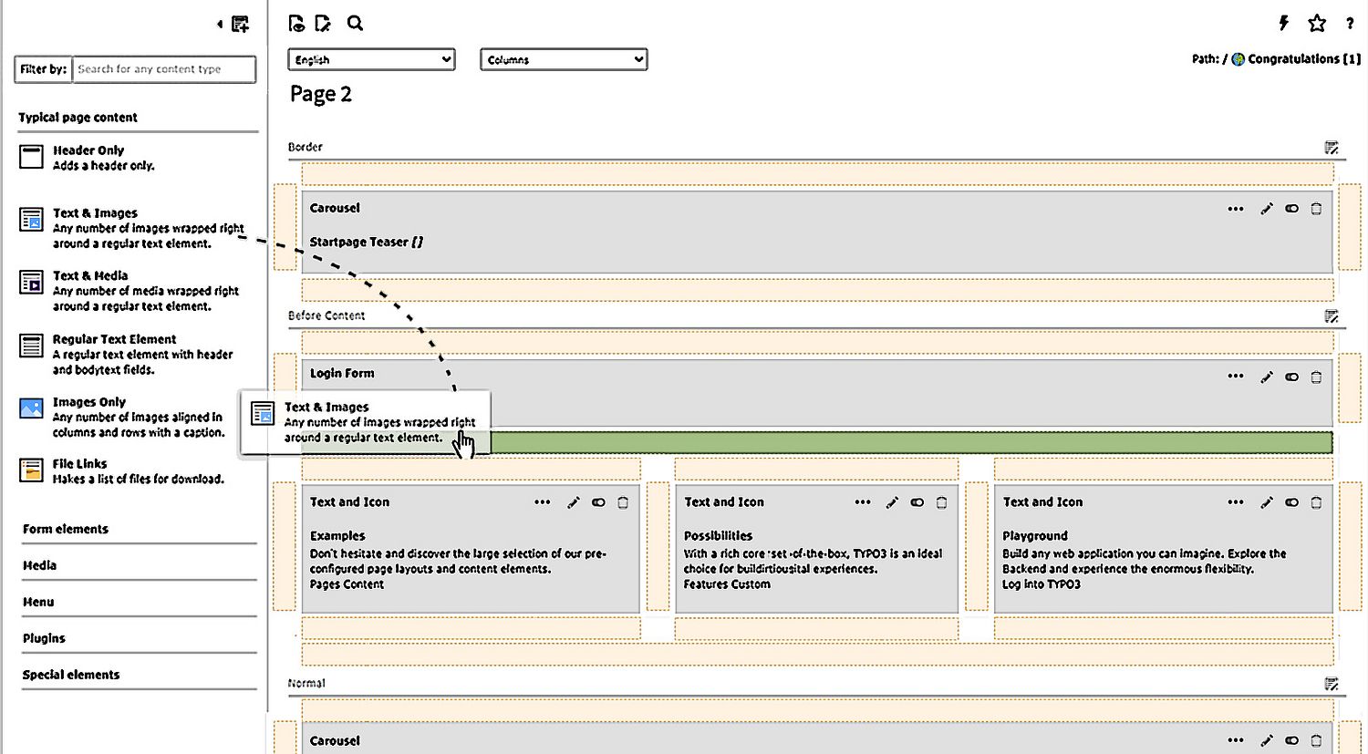
Today, when we add new content to a page, we only can add it above or below an existing content element. Let's say that tomorrow, you could also add it to the right or left of an existing content element. This would open up many more possibilities and with minimum actions to take or decisions to make.

This screenshot below is intended to represent the concept only.

If new content is added above or below existing content, it will naturally occupy the same width as the existing content. This is what an editor expects.

On the other hand, if an editor puts new content to the right or left of existing content, the editor doesn't really know in advance how wide it needs to be. Very often, it will be necessary to adapt according to the result obtained after viewing the frontend.

Resizing a grid column should not make the editor leave the page module, it must be possible to do it directly with the mouse (or finger) and it must be naturally guided on the allowed dimensions in the grid.

We are not going to reveal everything today, as we still have some concepts to finalize. These include responsive breakpoints management, content settings editing, frontend visualization scenario, etc. We will come back with our new ideas in the next article of course!

Collaboration With Other Initiatives

Our initiative has had many interactions with other initiatives over the last two months. This is very important, because when the different initiatives exchange ideas and progress, it allows them to ensure maximum coherence, and avoid wasting time and energy in the wrong directions.

The group content block creation works regularly with members of the Datahandler & Persistence Initiative to ensure that the choices are in line with the overall strategy of this initiative. It is also the Datahandler & Persistence initiative that will help us decide on the best approach to data handling for the new grid system.

As a result of our first call with the Accessibility Initiative, we have agreed to collaborate regularly with them. In particular, we will take accessibility into account in the definition of personas, as well as to write the acceptance criteria of our user stories. Indeed, it will be much more efficient to take accessibility into account upstream rather than asking the Accessibility Initiative to do a cleaning job when everything has been developed. 

Finally, Mathias Bolt Lesniak, leader of the Frontend Editing Initiative, warmly invited us to participate in two brainstorming sessions to present his ideas and collect ideas from interested participants. These exchanges allowed us to discover that we had many concepts in common, and that it would indeed be very interesting to continue exchanging on our progress, particularly to optimize a good coherence between frontend editing and the page module from a UX point of view, and to facilitate the development of frontend editing from a “Content Block creation” point of view.

News From “the Underground”

After finalizing the technical draft of the content block registration process many aspects still needed to be clarified before we could think about coding. Especially the fact that the editing interface of a content block should be written in YAML raised questions. With kind support from Oliver Hader and Benni Mack of the Product Team, we managed to refer to all points in the draft’s FAQ section.

YAML is the New TCA (Table Configuration Array)

Having the definition for the editing interface of a content block in YAML while storing the data as JSON blob made us realize that we don’t need to make every aspect of TCA available in the YAML configuration. Unlike in TCA, the definitions of a field's view-related properties are separated from its database related properties. In our opinion, this is very important as the main goal of this concept is to ease the learning curve for content block creation.

Regarding this aspect, we decided to define the field types for the editing interface YAML heavily inspired by the Symfony field types. As Symfony is quite mainstream, well-established, and documented it makes it easier to understand those types for TYPO3 newcomers, beginners, or frontend-only devs as compared to TYPO3's exclusive TCA, thus providing a kind of ubiquitous language.

The newly defined editor interface field types are then mapped to TCA properties for visual representation during the content block registration process.

Having a strict schema for field types also eases up the validation process for field definitions which is currently not really possible with TCA. Using a field type mapping also allows us to use defaults for field properties (e.g. default size for input is 30). That way not every property needs to be defined in the editing interface YAML making it slim and easier to overview.

Side note on TCA: Currently, there is a long term goal to refactor TCA, but it is unknown when this will happen. With Symfony-based field types, we wouldn’t have a breaking change in the configuration, but only “under the hood” in that case.

You are familiar with Symfony or simply want to have a say on the mapping? Your help is much appreciated! Simply contact us in the group channel #cig-structuredcontent-contentblockcreation on Slack.

Are We Coding Yet?

Almost there! After taking a deeper look on data storage and visual representation of a content block while defining the editing interface field types, we identified upcoming task groups:

  • Concept to handle JSON blobs with Doctrine DBAL and Extbase.
  • Define a JSON schema for content blocks and validate them against it.
  • Validation of editing interface YAML.
  • Provide required data for FormEngine and DataHandler.
  • Concept for Localization.
  • Concept for Workspaces.
  • Permission handling.
  • Frontend rendering.

Thanks again to Oliver Hader for his significant input!

Although some of the task groups (like Workspaces and Localization) still need a detailed concept, other task groups (like JSON schema and validation) are quite clear.

Star and watch the TYPO3 Structured Content repository on GitHub to be notified of upcoming feature issues.

There is one more task that is clear, yet further in the future: Community Content Blocks. Just like developers can share their extensions on TER (TYPO3 extension repository), we want to enable integrators to share content blocks on a new platform: the TCBR (TYPO3 Content Block Repository).

The Structured Content Initiative team.

 
Proofreading: Heather McNamee • Publishing: Mathias Bolt Lesniak