UX and TYPO3—the Challenges for the Next Five Years

Categories: Community, TYPO3 CMS Created by Rachel Foucard and Annett Jähnichen
Photo: Olav Ahrens Røtne / Unsplash.com
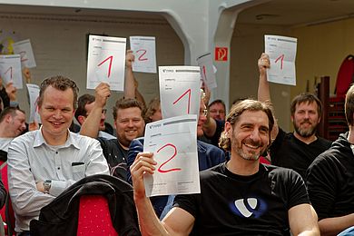
During the T3DD22, Annett Jähnichen and Rachel Foucard presented the TYPO3 UX Team and its work. With this article we would like to give you an overview of the UX strategy we are building for TYPO3 for the next five years.

Who Is Involved In Improving TYPO3 Backend UX?

Actually, a lot of people! The obvious answer is the Core Team. But really all the TYPO3 Teams and Initiatives impact the product UX and UI. And let’s not forget the entire TYPO3 community. When TYPO3 developers and integrators are implementing solutions, their decisions strongly influence their customers' user experience.

The TYPO3 community has always taken user experience seriously. The topic of UX has a long history in the TYPO3 ecosystem, and did not commence with the forming of the UX Team. TYPO3 UX weeks were organized from 2014 to 2018. In 2019, this event was transformed to the more global TYPO3 Initiative week. UX folks met in the UX subgroup of the Structured Content Initiative. After working for several years within the Structured Content Initiative, the UX Initiative was founded last year and became an official Team in April this year.

We use a bridge system to keep UX activity consistent across teams and initiatives. 

  • Rachel Foucard is the UX Team lead. 
  • Annett Jähnichen is the Core merger for the User Interface component and the SCI bridge. 
  • Paul Hansen is the Co-lead and the Accessibility Team bridge
  • Benni Mack, as the TYPO3 Product Owner, is the Core Team bridge and keeps us on track with the Core development.
  • Lina Wolf is the Documentation Team bridge, and she is involved when necessary.

Where Does TYPO3 UX Maturity Stand?

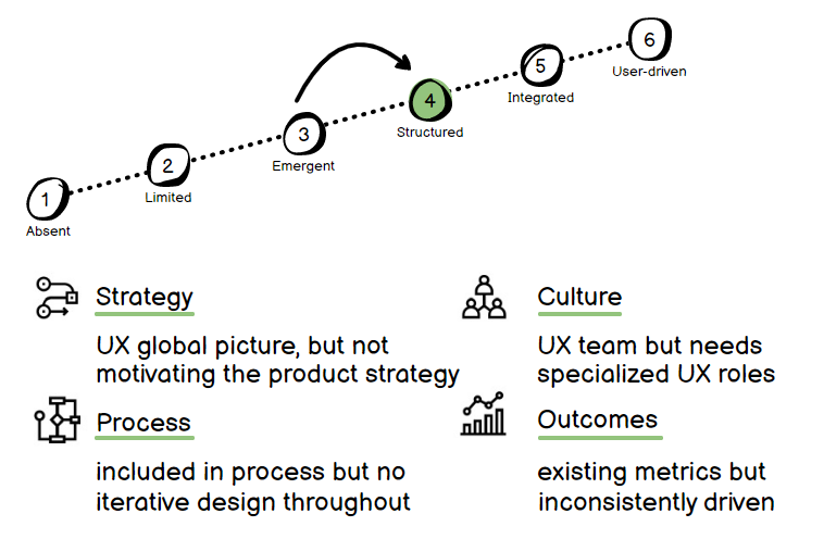
The UX maturity of a product can be evaluated along six levels, starting from the absent status to the user-driven status. A maturity level is evaluated according to four main axes: strategy, culture, processes, and outcomes.

When we founded the UX Team we judged the TYPO3 product to be at level 3—which is an excellent level for an open source project without a dedicated UX team. 

There was no global UX picture, which is only natural, since there was no UX team to build it. However, the organization’s culture always took UX as a nice to have topic and the developers often took care of this aspect in their new features. The processes were built to maintain and improve the existing product, without UX steps in the workflow. This is again logical and normal, considering the missing dedicated team. There were no metrics to track the UX results of interface changes.

So our goal was to first move from level 3 to level 4. We decided to: 

  1. Found a dedicated team (done) 
  2. Build a global UX picture (done)
  3. Integrate UX tasks into workflows (WIP)
  4. Set up metrics to track results (WIP)

This is only level 4. TYPO3 UX will be structured but still not fully integrated. We still have work to do to reach level 5.

What Do we Mean by a Building UX Strategy?

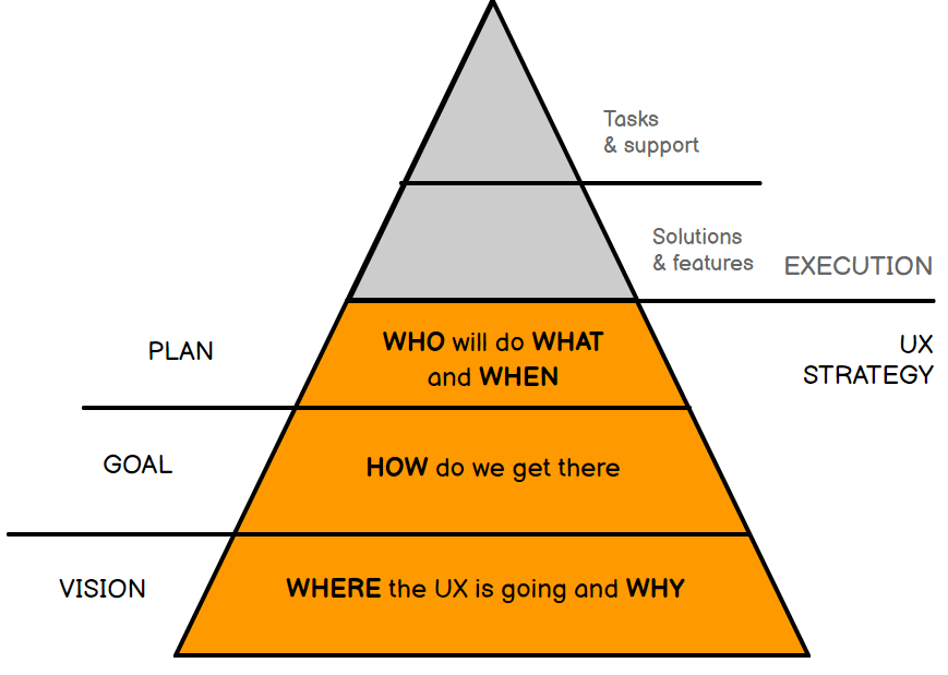
To handle the execution aspect of a product’s user experience, we need people, processes and tools. But without a strategy, we are only able to fix UX issues, improve existing features, and react to existing problems. Without the bigger picture, we are missing the meaning of all our UX decisions. 

We waste time and resources by working on independent pieces of a product without converging in a well-defined direction. Without a UX global strategy, we can probably improve pieces of the user experience, but a great List module, or a powerful translation system will never make a good Content Management System as a whole.

The UX strategy is the foundation on which we find meaning in the execution. The vision tells us where we want to go and more importantly why. Then, we can set the goals and see how we get there. Finally, we can make a real plan, and decide who does what and when.

What Should the TYPO3 User Experience Be?

If you go to the home page of typo3.com or typo3.org, the first word you read to define your favorite CMS is Professional. This word is important, because it creates expectations. So our users should have a professional experience when using TYPO3? How do we translate this in terms of content management? 

When we think professional, we think:

  • High quality: The generated contents respect the standards, the best practices, and are secured. The user can trust the information displayed, the tool does not mislead.
  • Productivity: The user can handle a large amount of websites, languages, pages, contents, or editors.
  • Efficiency: The user can perform tasks efficiently, whether they are one-off tasks or mass actions. Content is the value that the user is generating, so they must be able to create it fast and easily.

To sum it all up in one sentence: Users get more results with less effort and less time.

The good news is that it has exactly the same definition for sustainability! And we know that tomorrow, nobody will want to work with a tool that does not take this matter seriously.

What Is the TYPO3 UX Big Picture?

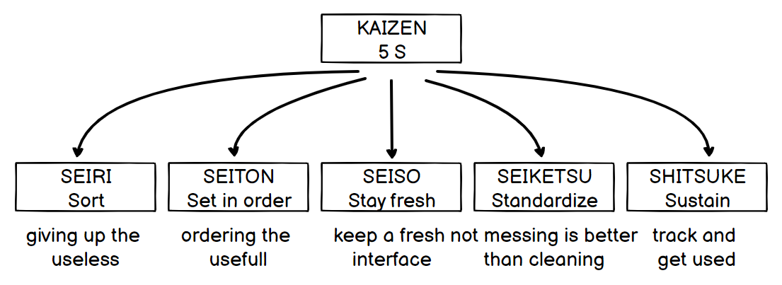
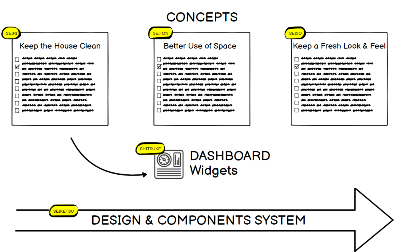
Have you ever heard of Kaizen? For those who don't know, here is a very short definition: The Japanese word kaizen means change for better, it is a continuous improvement set of methods that consists in making important changes by small steps. One of the Kaizen tools is the 5S. This technique is designed for efficiency and productivity, while ensuring a pleasant working climate. 

Like all methods, if it’s followed literally without common sense, it can become a creativity killer. That's not what we want to do, instead we will use this method as an inspiration and translate it into a guidance for our users. The 5S main goal is to maintain a pleasant and efficient professional working area, and this is exactly what we want for our users.

The first S, SEIRI, is about giving up the useless. For example, we want editors to stop keeping useless pages and content, and stop hiding everything instead of deleting.

The second S, SEITON, is about ordering the useful. For example, an editor should have action buttons or modules that they most often need to be more accessible than the others.

The third S, SEISO, is about keeping a fresh working area. Because there is no dust in a virtual working space, in terms of UX we can translate that to keeping a fresh look-and-feel. So that the users keep enjoying working with modern tools.

The fourth S, SEIKETSU, is about creating standards, guiding the end-users to follow good processes. For example, a developer shouldn’t wonder how to build a specific module UI, and should have components ready to use that will follow the overall TYPO3 UX standards. Then editors won’t mess up their working area because of a poorly designed interface.

Then, the fifth S, SHITSUKE, is about sustaining the processes. For example, editors could have dashboard widgets tracking records that haven’t been used for a long time that suggest having a look at them.

UX work is based on concepts. When we want to create, improve or change something, we call it a concept. So we started to find concept categories (or thematics) that would be consistent with our main goals. It means that UX concepts that don’t fit into these goals won’t be our priority for the next TYPO3 version.

The three thematics are: 

  • Keep the House Clean, to help end-users not mess up the TYPO3 backend. 
  • Better use of space, to help end-users work efficiently. 
  • Keep a fresh look and feel, to enure that-end users will enjoy using the TYPO3 backend.

Another task that is longer term and will continue through the releases is to gradually build a component system for developers and integrators.

Then, as good practices are implemented in the backend, the dashboard widgets will finally make sense, and help users sustain their TYPO3 backend cleanliness.

How Do we Work?

It always starts with a problem to solve. If your idea isn’t born from a problem to solve, you may not improve the UX. If we consider that this problem fits in our priorities and topics, we start some UX research first to answer the most important question: Why? For example: “Why does a user prefer to hide and keep their content rather than deleting it?”

Then, we fill a table with 10 Usability Heuristics for User Interface Design  to help us gather all the interface issues and possible improvements. When this concept document is ready enough, we can start with drawing mockups if needed, or directly propose a solution.

Annett & Rachel presented a concrete example of our UX workflow during the TYPO3 Developer Days 2022. 

How Do You Fit in Here?

Even if there is a UX Team, you are part of the project. As a Developer, Designer or Integrator be aware that you also influence the backend UX. 

So what can you do? As a developer, you can use the existing official Styleguide extension when you create any backend UI. As an Integrator, when you think about your editor workflow, you can consider the consistency with the existing core modules. 

If you are not sure, you can ask anytime in the #cig-ux TYPO3 Slack channel. We are always interested in discussions about possible improvements and would like to get in contact with you. If you find some inconsistencies in the current behavior, you could help us to create patches for those issues. 

If you are interested in this topic but you don’t feel like a UX expert, please do not hesitate to contact us, we are always searching for people. 

We need you!

Useful Links

Additional contributors for this article
  • Proofreader : Felicity Brand
  • Content Publisher : Mathias Bolt Lesniak