Dynamic Grid

The motivation

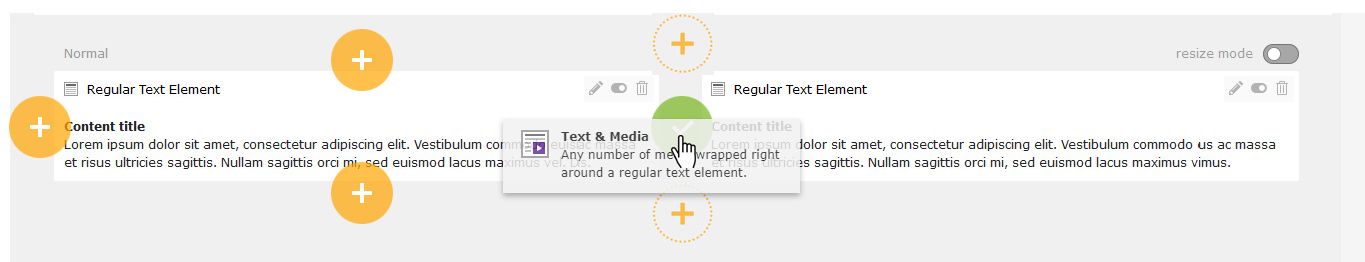
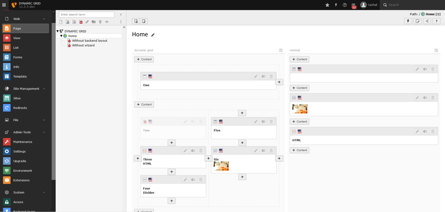
First of all, the editors are not (often) developers, that seems obvious, but it's always a good thing to remember that. Today, plugins that allow you to add grids dynamically in pages are structured with rows and columns, and the content is dropped inside the columns. Rows, columns, content - it's a very clear vision for a frontend developer, but for an editor, it doesn't make sense.

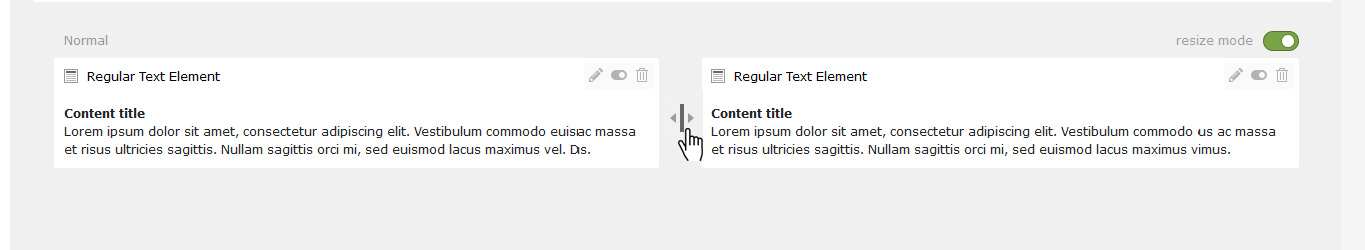
When editors want to put an image to the right of a text block, they don’t see the point of adding a set composed of a row and two columns that should contain a text block in the left column and an image block in the right column. This adds a lot of steps, clicks and questions before they even see the result on the frontend. The editors have only one simple request: put the image to the right of the text, and see if it's more beautiful than on the left, and then maybe adjust the width of the image and text.

In addition, these complicated systems that nest rows, columns and content add as many buttons and dividing lines as there are items in the page module. This makes the interface difficult to grasp.

The concept Dynamic Grid

The interface of the Dynamic Grid does not visually represent the content structuring technical aspects—even if HTML is built with rows and columns behind-the-scenes. The Dynamic Grid only represents what the editor needs and nothing more.

Today, when we add new content to a page, we only can add it above or below an existing content element. Let's say that tomorrow, you could also add it to the right or left of an existing content element. This would open up many more possibilities and with minimum actions to take or decisions to make.

If new content is added above or below existing content, it will naturally occupy the same width as the existing content. This is what an editor expects.

On the other hand, if an editor puts new content to the right or left of existing content, the editor doesn't really know in advance how wide it needs to be. Very often, it will be necessary to adapt according to the result obtained after viewing the frontend.

Resizing a grid column should not make the editor leave the page module, it must be possible to do it directly with the mouse (or finger) and it must be naturally guided on the allowed dimensions in the grid.

Technical implementation

As far as the backend is concerned, the dynamic grid system will be based on CSS Grid Layout. This solution has many advantages and offers a simple and modern method for editors to quickly structure content blocks in a freely “divisible” area.

What do editors want when they need to visually structure a page? Sometimes, they need to divide the content into perfectly equal parts whether it is for 2, 3 or 5 columns. Sometimes, they just want to give more space to one content or less space to another, without needing to know the multiples of 12, or to subtract to get 100%. They don't have time for that.

This is where fractional CSS units go from the status of "boring mathematical calculation" to the status of "obvious solution to all our problems.” Of course, we are certainly not going to ask the editors to calculate fractions—TYPO3 will do it for them. They will simply think in "pieces,” like pieces of a cake. An editor might say, "I need 3 equal parts," or "this content should take twice as many parts as the others.” This is how editors need to think about their content, because its position and the space it takes up on the page corresponds to editorial logic, its importance, its priority, etc.

As for the JavaScript part of the backend we decided to refactor our current POC to the Lit Element approach. Lit is already used in the backend of TYPO3 version 11.3 and improves the maintenance of its JavaScript/HTML functionality.

The grid information of a page is stored in JSON in the page properties. The Dynamic Grid can be enabled per colPos in the backend layout configuration.

Current state

For the Dynamic Grid we decided to implement it as an extension first, to evaluate the proof of concept—just like we did for the Content Blocks, so that it can be tested easily in a stable environment.

The most difficult part about the technical implementation was to pass the data regarding the placement of a new content element in the grid to DataHandler. This was tricky because the NewContentElementController currently does not have any suitable hooks. With some additional XClassing we managed to create a working prototype, which handles the following cases when adding new content elements:

  • Add a new row
  • Add a new column in an existing row (left, right and in between)
  • Add an element in an existing column (above,below and in between)

Help wanted!

Currently, there are three areas we are working on in preparation for the Dynamic Grid:

  • Adapting the stylesheets to give the Page Module a more modern and fresh look.
  • Refactoring of the generated content element markup (in the backend) as Lit Elements.
  • Developing a Data Handling concept for the Dynamic Grid.

Get involved!

On Monday 20:00 CET every 1st and 3rd week of the month on Slack:
#cig-structuredcontent