Authoring Experience

TYPO3 provides an intuitive and easy-to-use authoring experience. Content editors can independently create, review, and publish their content.

When publishing content across multiple channels and in multiple languages, any technical bottleneck will affect your editors’ ability to efficiently produce good content.

TYPO3 is a centralized, easy-to-use platform for content publication. With role-based access and streamlined production and translation workflows, you can maintain quality and production velocity while publishing in multiple languages and on multiple sites and channels.

Improvements for Editors

Introduced in version 9.2

TYPO3 would not be so successful as it is today, if we only concentrated our efforts on improvements  for integrators, developers and administrators. Backend users, e.g. editors, have always been in our focus. Two notable new features in TYPO3 v9.2 especially for this target audience prove this again.

A content element on a page can often be used as a template for other, very similar elements. This could be a text/image for example, where most of the individual settings, e.g. the headline, visual appearance, access restrictions, etc. should be exactly the same or only need minor adjustments. In these cases, it makes sense to clone the existing element, which has been possible already by using “WEB → List” and copy/paste functions. However, this process requires a number of steps and clicks.

A new button “Duplicate” has been added, which appears when adding or editing a content element in the backend. With one click, backend users can clone a content element, which simplifies the process significantly.

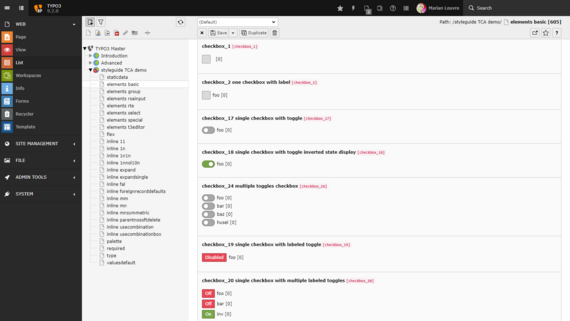
The second improvement directly impacts the backend user interface (UI) and affects editors, as well as developers and designers alike. A set of so-called “toggle switches” have been introduced in TYPO3 version 9.2, which do not only look nice, but are also a useful tool to allow backend users to switch between two states easily.

The render types “checkboxToggle” and “checkboxLabeledToggle” can now be used for the checkboxes. On top of that, checkboxes are now displayed with icons provided by the IconFactory.

Documentation

>
>

Unassigned Content Elements

Introduced in version 9.0

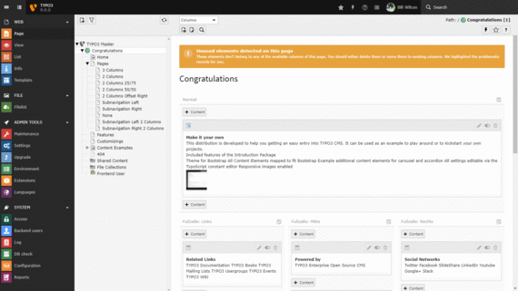
Content elements, which are not assigned to any column are shown in an additional column named “Unused” at the end of the page. This makes sure, that these elements do not get lost when switching from one backend layout to another with different columns. 

Even if the layout is switched back to the original one, the elements nicely fall back into their original position.

>

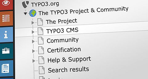
New Page Tree

Introduced in version 9.0

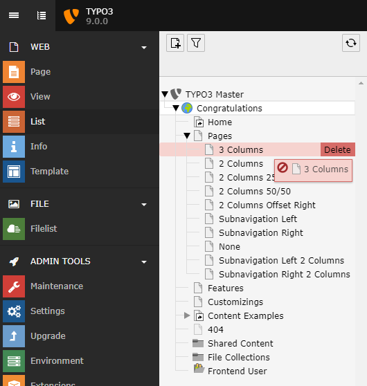
Performance optimization and the leverage of modern web technologies has always been on our agenda. We are proud to present a re-worked page tree in the backend of TYPO3 v9, which is based on SVGs and features superfast rendering times.

The new page tree enables us to finally remove ExtJS from TYPO3 completely. A goal we aimed for, for a very long time - no ExtJS in the TYPO3 backend anymore!

Documentation

>

Creating New Content Elements

Introduced in version 9.0

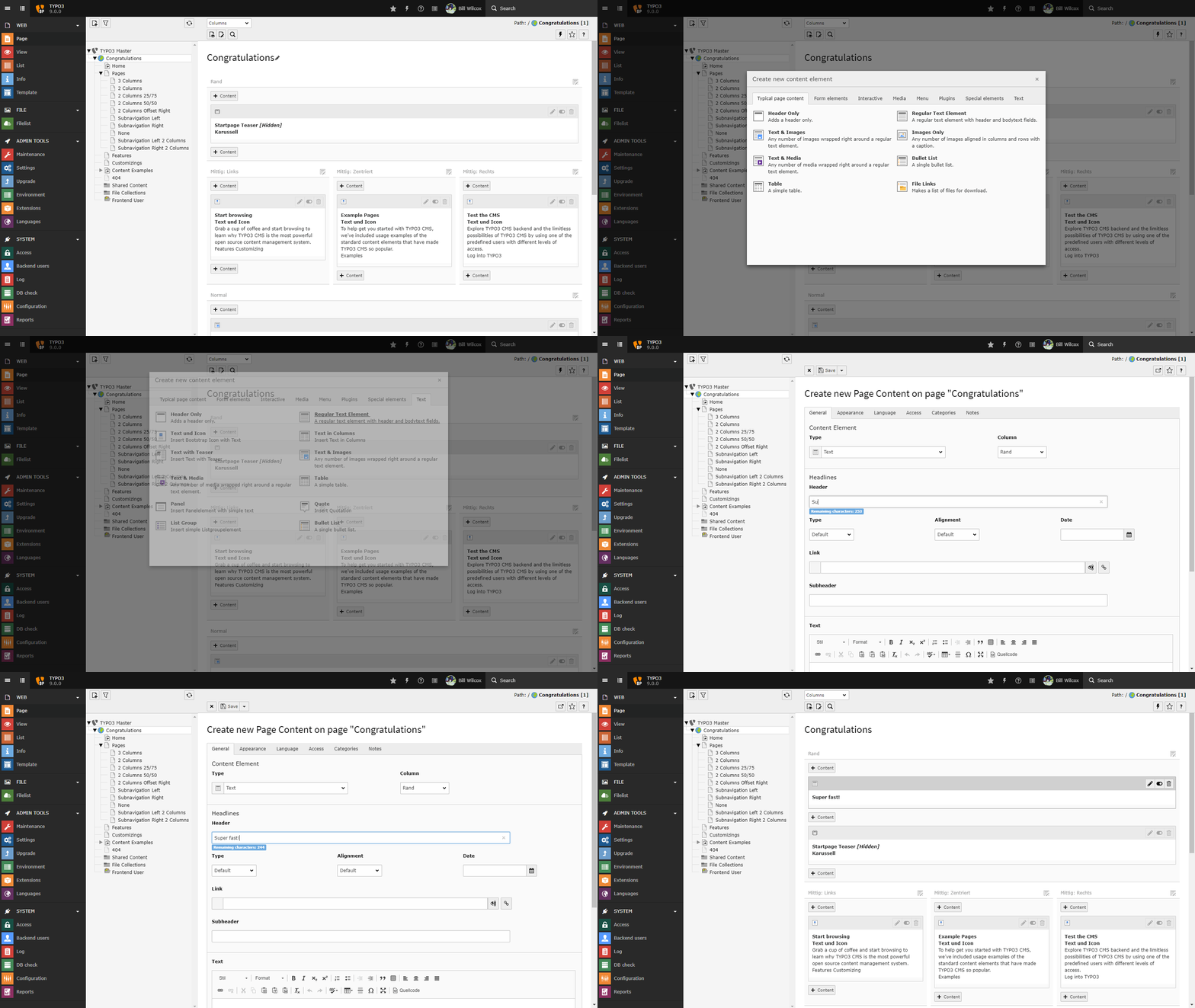
Editor and integrators will experience that modal boxes will appear more often in the backend of TYPO3. A first step in this direction has been made by moving the wizard for the creation of new content elements into such a box. This helps users not to loose the focus of the context where new content is created.

Further implementation of this concept will follow in subsequent releases of TYPO3 v9.

Documentation

>

Re-Designed View Module

Introduced in version 9.0

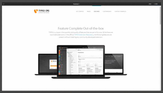
Websites are accessed using a wide range of devices and screen sizes today. The need for editors to check the appearance of a page is obvious and the view module allows backend users to do exactly this. 

The view module received a modern and streamlined look and feel in TYPO3 v9. The introduction of named and categorized device presets makes it even easier for editors to view a page and to get a better idea of what the page looks like on a specific device. Even the device orientation can be changed without selecting a di

Documentation

>

Image cropping

Introduced in version 7.6

An image manipulation functionality allows editors to crop images in the backend. This way you can cut out a certain area of an image that appears in the frontend of your website, without changing the original file – it remains intact and can be used later on. No additional software needs to be installed for this: this feature is part of the TYPO3 CMS backend now!

The image cropping functionality is also available to integrators to be used in custom content elements and extensions as well.

Drag & Drop for uploading files

Introduced in version 7.3

If a file upload would overwrite an existing file, editors can choose an action (e.g. replace, rename or skip) conveniently in a modal popup. And if that wasn't enough: this feature works for multiple files, too! Mass­ update has never been so easy!

Responsive Backend

Introduced in version 7.1

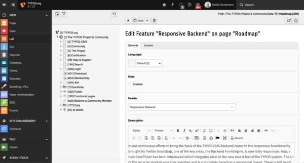
In our continuous efforts to bring the basis of the TYPO3 CMS Backend closer to the responsive functionality brought by Twitter Bootstrap, one of the key areas, the Backend FormEngine, is now fully responsive. Also, a new DatePicker has been introduced which integrates nicer in the new look & feel of the TYPO3 system.

The UI of the recycler module was also rewritten and is completely based on a responsive layout.

There is still much to do, but through the agile process of the releases it is easier to split up certain tasks into smaller finishable jobs that contributors pick up.

>

Selectable Columns

Introduced in version 11.3

The List module lets backend users work with various database records. Users can now easily select the columns to be shown in the list. This was possible in older TYPO3 versions but only in the “single table view”. The updated user interface makes it much easier for users to add and remove columns.

TYPO3 integrators can customize the view by applying a few lines of User TSconfig, and can disable the “column selector” for specific tables or for all tables as required.

Documentation

SVG-based Page and File Tree “Everywhere”

Introduced in version 11.2

In TYPO3 v9, we reworked the page tree, switched to a SVG-only approach, and removed all ExtJS code from the backend. This resulted in super-fast rendering times and has made working in the page tree much smoother. We further optimized this area in v10 and reworked the “Filelist” backend module in TYPO3 v11.1 earlier this year. Since then, the folder list uses the same lightweight technique as the page tree. Guess what — we did not stop there!

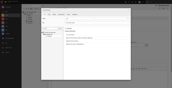
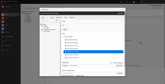
Both components, the page tree and the file/folder list, also appear in the “Record Selector”. This is the modal window that lets users select a page, a file, a folder, an external URL or an email address, etc. The Record Selector now features the same state-of-the-art components and architecture for the page tree and the file/folder list.

Users can, for example, apply a filter and collapse the tree component. Content elements are now much easier to find and select. They appear neatly listed in the content area. An input field at the top lets users filter the folder list based on search terms. TYPO3 even takes file names into account and shows a list of folders that contain files matching the pattern that users specify.

We used the SVG-only technology that is lightweight, slim, and renders super-fast in all modern browsers. As the data is loaded using JSON-based AJAX, only the required parts of the trees are fetched from the server. The same applies to the content area which results in an incredible performance boost when working in the backend.

Whenever a tree component (page or file tree) comes into play, its visual appearance and functions are now streamlined and consistent across the TYPO3 backend. Backend users can even use their keyboard to navigate within the tree components.

>
>

Deep Linking in the Backend

Introduced in version 11.2

Some members of the TYPO3 community scratched their heads when we announced our intention to implement deep linking and link sharing for the TYPO3 backend. What are the benefits and do we really need this feature?

Deep links are nothing unusual in the frontend. If you are interested in TYPO3 Association memberships, for example, you visit the typo3.org website and navigate to the respective page. You eventually end up at typo3.org/project/association/membership. This link represents the path to the piece of web content on the website. You can bookmark this link in your browser and/or send it to your colleagues.

Users now have this option when they work in the TYPO3 backend too. You will soon realize how amazing and helpful this feature is.

Let’s look at a few examples of what you and your backend users can do with deep linking and link sharing.

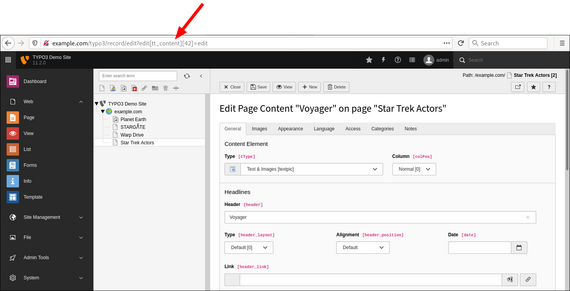
If two or more editors are responsible for maintaining the content of a website, they can now easily point their colleagues to a specific target in the backend. This is not limited to a page. Backend users can, for example, share a deep link to a particular content element:

Hello Spock. I updated the crew roster page as discussed. Could you please add your working shifts to the following content element:
https
//example.com/typo3/record/edit?edit[tt_content][3]=edit.
Thanks, Uhura.

Backend users who frequently update the same content of a page now have the option to bookmark the link and open it directly. If they are not logged in to the backend yet, the login form appears, and the user is automatically redirected to the right target once successfully authenticated.

Those experienced with TYPO3 often have to guide a newcomer or client through the backend. Sometimes in an email, sometimes remotely on the phone. Do instructions like the following sound familiar to you?

Please locate the module ‘Web’ in the backend on the left-hand-side, then click on ‘List’. Now choose the page ‘Star Trek Actors’ from the page tree. If you don’t know where the page is located in the page tree, enter the name in the search box. Once you click the page, locate the table ‘Voyager’ in the content area. Then...

This is all history now. Integrators and clients can simply share a deep link. The recipient follows the link and ends up at the right place. Quick and easy.

There is no doubt that backend users will embrace this feature as it makes working in the backend much more efficient.

>

Resizing/Toggling of the Navigation Area

Introduced in version 11.1

Space travelers around the galaxy know how important a user-friendly control panel is. It can save your life if you detect meteor showers early during your journey. As a TYPO3 backend user, your life usually doesn’t depend on it. Still, the option to adjust the backend view to your individual needs makes your day-to-day work easier and more pleasant.

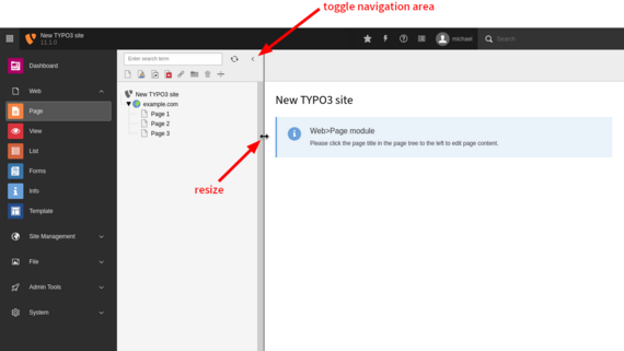
The navigation area has had a fixed width since TYPO3 version 8. This area is the second column from the left in the backend, which shows the page tree (when modules under the “Web” section are accessed) or the file list (section “File”). Sometimes, the fixed width caused problems. In TYPO3 instances with long page titles and page trees with many levels, the contents in this area were cut off.

We reworked this component and reintroduced a resizable navigation area in TYPO3 version 11.1. We also got rid of a lot of JavaScript code.

We moved the icon to collapse and reopen the navigation area inside the panel. This location is now a better place from a usability perspective. You don’t need to readjust the navigation area’s width every time you re-login to the backend. TYPO3 remembers the last setting and restores the previous state on the next login.

By using CSS/Flexbox scaffolding, browsers now load the TYPO3 backend faster. Also, less data is transferred between TYPO3 and the client, which improves performance.

Documentation

>

Dashboard

Introduced in version 10.3

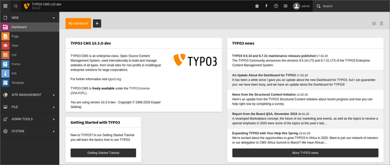
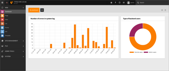
This biggest and probably the most exciting new feature that has been eagerly awaited by the community made it into the TYPO3 core in time: dashboards.

The dashboard  provides backend users with a quick overview of important system information and statuses. At-a-glance information is displayed in widgets, and a wide range of types and styles are available out-of-the-box. Some standard widgets are included in the TYPO3 core, for example a “call-to-action button”, the Getting Started Tutorial, the TYPO3 news as a RSS feed, and some basic information about the current TYPO3 instance.

Flexibility and expandability were important factors during the concept phase and development of dashboards. Developers can create their own widgets and backend users can not only configure multiple dashboards (and easily switch between them), but also add, remove, and even rearrange widgets to their heart’s content.

To learn more about dashboards, read the article “An Update About the Dashboards” by Richard Haeser (Initiative Lead).

Documentation

>
>

Backend notifications

Introduced in version 10.1

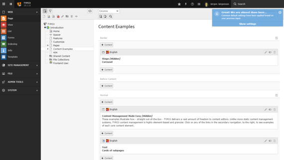
“Notifications” are an essential element of the user interface. These are small boxes that sometimes pop up in the top right corner of the TYPO3 backend and inform the user about certain events. This could be a notification about a process that successfully finished, a warning that something occurred unexpectedly, or a fatal error to inform the user that he/she is really in trouble now.

Wouldn’t it be awesome if these notifications would feature buttons the user can click? Good news: as a matter of fact, developers can now implement actions to execute JavaScript functions.

However, keep in mind that notifications usually disappear automatically after a few seconds, so think carefully how users may interact with these components before you implement buttons in backend notifications.

Documentation

>